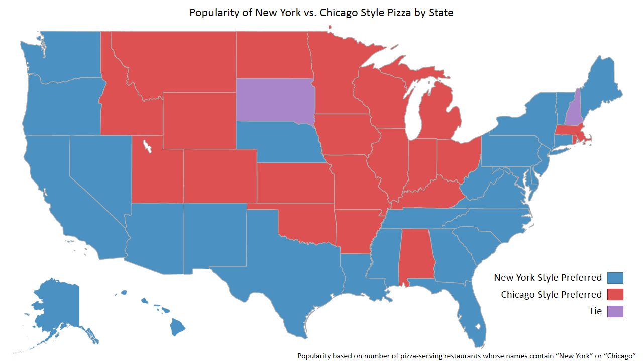
The debate on whether New York style pizza or Chicago stle pizza is better. This often varies depending on the state you were raised. Blue states say that New York stlye is better and red states say that chicago is better. The Purple States show a tie between preferences in the state.
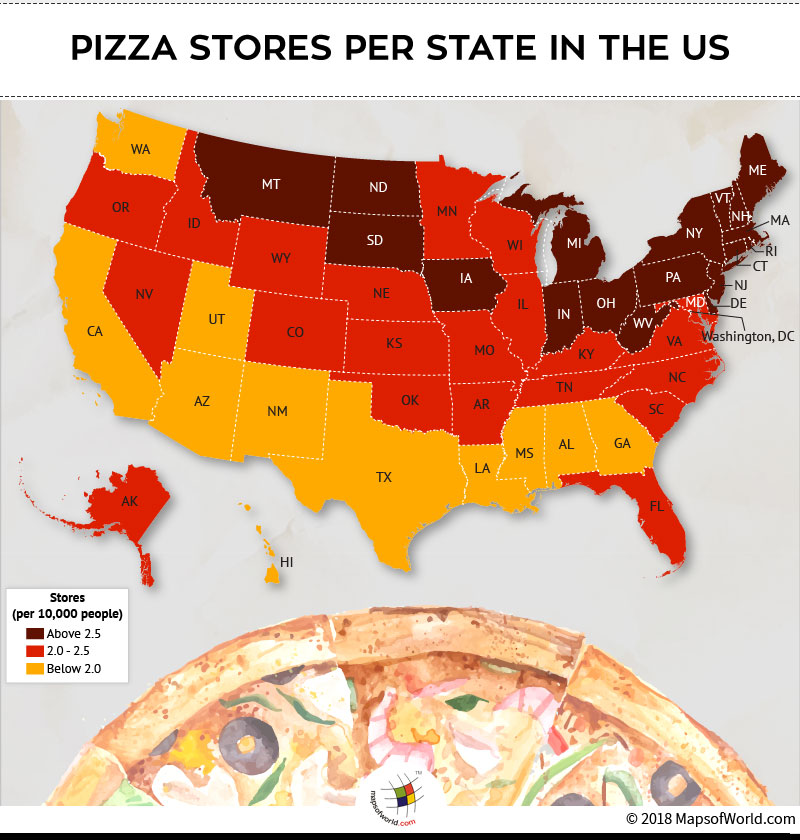
The distribution of pizza stores in the United States. The Dark red indicates that there is a higher concintration of stores, the red shows a middle ground between and the yellow incates the less stores per state. This map measures this by stores per 10,000 people.

Each state has a different favorite pizza topping. The color key shows the favorite toppings depending on the state.

The average price of a pie varies depending on the state. This is a break down of the cost of a pizza by state.
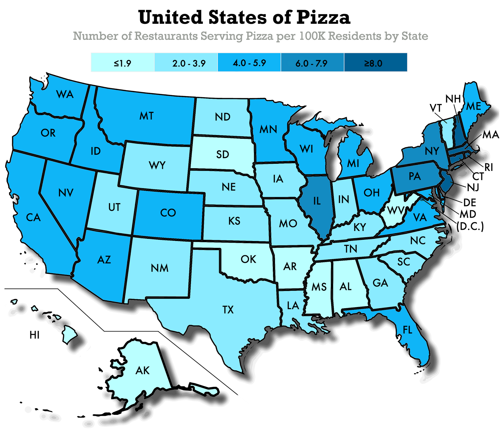
The amount of resturants that serve pizza varies. Sometimes this varies on the demand from people. The higher the demand, the more resturants serving pizza. Shadigs are used to show the catagories of data.
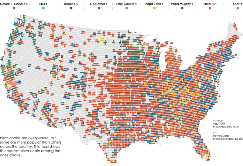
Depending on the region, your pizza chain preference might varry. This shows what pizza chains dominates in each area.

Most of the US is dominated by chain pizza resturants with the exception of the North-East, Alaska, California, Nevada, and Illinios.

The colors depict the various foods that Americans enjoy consuming.The red shades are areas where pizza is the most popular food.
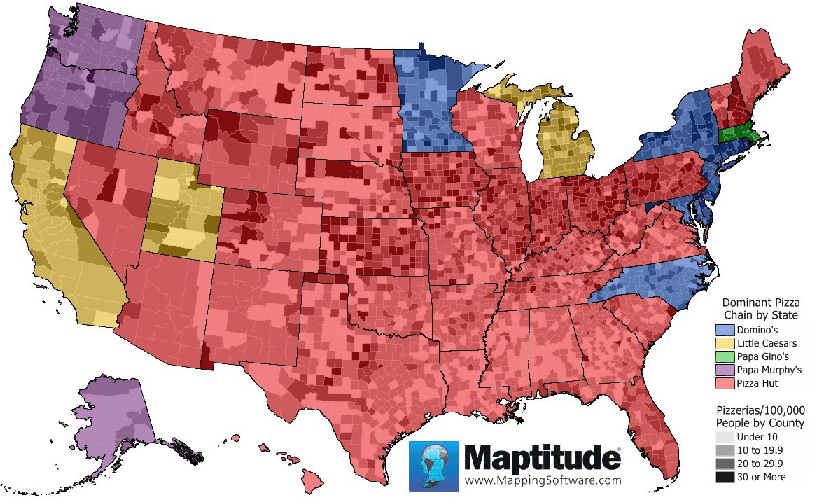
The different colors indicate the different pizza chain that is prefered in the US. Pizza is showed as the most popular pizza chain in the US with Dominoes in second place.
Produced by Natasha Zerba